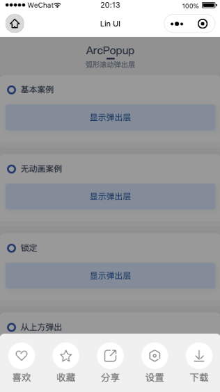
# ![]() ArcPopup 弧形滚动弹出层
ArcPopup 弧形滚动弹出层
Popup弧形滚动弹出层组件。
该组件支持wx.lin用法。
注意事项
为保证文档低阅读难度,详细代码请去github (opens new window)查看。
# 基础使用
本组件可设置 show 属性展示或隐藏组件。
# 代码演示
<l-arc-popup show="{{true}}">基础案例</l-arc-popup>
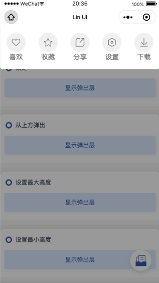
# 最大/小高度设置
本组件默认最大高度 600 ,单位为 rpx ,可自行更改 max-height 属性重置最大高度。
本组件默认最小高度 200 ,单位为 rpx ,可自行更改 min-height 属性重置最小高度。
注意事项
如插槽内容高度超过设置的最大高度,则插槽内容可滚动。
# 代码演示
<l-arc-popup show="{{true}}" max-height="600" min-height="200">
  <view style="height: 800rpx;">
      超出高度可滚动
  </view>
</l-arc-popup>
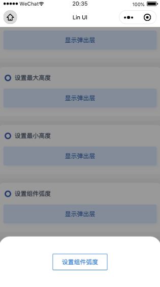
# 组件顶部弧度
本组件顶部默认弧度为 18 ,单位为 rpx ,可自行设置 arc-radius 属性进行更改。
本组件当 direction 为 top 时,属性值为 12 ,为 bottom 时,属性值为 18。
# 代码演示
<l-arc-popup show="{{true}}" arc-radius="50">
  设置组件弧度
</l--arc-popup>
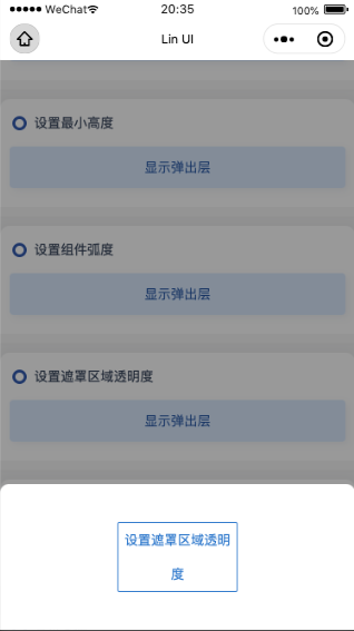
# 遮罩层区域透明度设置
本组件默认透明度为 0.4 ,最大值为 1 ,可自行设置 opacity 属性进行更改。
# 代码演示
<l-arc-popup show="{{true}}" opacity="0.8">
  设置遮罩区域透明度
</l--arc-popup>
# 从上/下弹出
本组件默认从下至上弹出,通过设置 direction 属性的值来控制从不同的方向进入屏幕,可选值为 top 、bottom。
# 代码演示
<l-arc-popup show="{{true}}" direction="top">
  从上方弹出
</l--arc-popup>
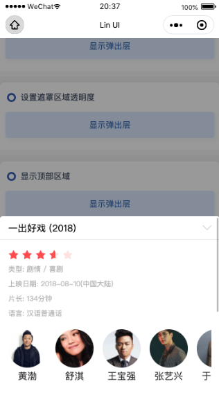
# 显示顶部内容(高级用法)
通过插槽 header 可以像顶部区域插入内容,设置 header-fixed 属性可设置此部分内容是否有吸顶功能。
# 代码演示
<l-arc-popup show="{{true}}" header-fixed="{{true}}" l-header-class="l-header-class" arc-radius="0">
  <view slot="header" class="header-content">
    <text>一出好戏 (2018)</text>
    <l-icon name="down" size="30" color="#ccc" bindtap="onHidePopupTap"></l-icon>
  </view>
  <view class="popup-header-demo">
    <l-rate score="3.6" disabled />
    <text class="popup-header-desc">类型: 剧情 / 喜剧</text>
    <text class="popup-header-desc">上映日期: 2018-08-10(中国大陆)</text>
    <text class="popup-header-desc">片长: 134分钟</text>
    <text class="popup-header-desc">语言: 汉语普通话</text>
    <scroll-view class="popup-scroll-view" scroll-x>
      <view class="popup-scroll-list">
        <view class="popup-avatar-item" wx:for="{{avartarList}}" wx:for-item="item" wx:key="index">
          <image src="{{item.imageUrl}}" class="popup-avatar-image" mode="aspectFill"></image>
          <text class="popup-avatar-name">{{item.name}}</text>
        </view>
      </view>
    </scroll-view>
    <view class="popup-header-line"></view>
    <view class="popup-header-title">简介</view>
    <view class="popup-header-contet-desc">马进欠下债务,与远房表弟小兴在底层社会摸爬滚打,习惯性的买彩票,企图一夜暴富,并迎娶自己的同事姗姗。一日,公司全体员工出海团建,途中,马进收到了彩票中头奖的信息,六千万!就在马进狂喜自己翻身的日子终于到来之际,一场突如其来的滔天巨浪打破了一切。苏醒过来的众人发现身处荒岛 ,丧失了一切与外界的联系……</view>
  </view>
</l--arc-popup>
# 案例演示

# 组件属性
| 参数 | 说明 | 类型 | 可选值 | 默认值 |
|---|---|---|---|---|
| show | 设置组件展示隐藏 | Boolean | - | false |
| max-height | 设置组件最大高度,单位为 rpx | Number | - | 600 |
| min-height | 设置组件最小高度,单位为 rpx | Number | - | 200 |
| arc-radius | 组件弧度,单位为 rpx | Number | - | 18 |
| z-index | 设置组件的页面层级 | Number | - | 777 |
| locked | 弹出层是否设定为锁定态 | Boolean | - | false |
| transition | 控制弹出层有无动画 | Boolean | - | true |
| opacity | 设置组件遮罩层区域透明度 | Number | 0-1 | 0.4 |
| direction | 控制弹出层内容区域的位置 | String | top/bottom | bottom |
| header-fixed | 控制 header 内容区域是否吸顶 | Boolean | - | true |
注意事项
arc-radius 当 direction 为 top 时,属性值为 12 ,为 bottom 时,属性值为 18。
z-index locked transition 属性继承与 Popup 组件内属性,与 Popup 属性功能相同。
# 组件外部样式类
| 外部样式类名 | 说明 | 备注 |
|---|---|---|
| l-panel-class | 覆盖内容面板区域的自定义外部样式类 | --- |
| l-bg-class | 覆盖背景区域的自定义外部样式类 | --- |
| l-header-class | 覆盖 header 插槽区域的自定义外部样式类 | --- |
注意事项
l-class 与 l-bg-class 样式类继承于 Popup ,与 Popup 样式类功能相同。
# 组件事件
| 事件名称 | 说明 | 返回值 | 备注 |
|---|---|---|---|
| bind:linshow | 组件展示后触发( show 属性为 true 时) | - | - |
| bind:linclose | 组件关闭后触发( show 属性为 false 时) | - | - |
# 插槽
| 插槽名 | 说明 | 备注 |
|---|---|---|
| header | 自定义header |
