# ![]() 卡片 Card
卡片 Card
基础卡片布局,常见应用场景为模块展示。
WARNING
由于本组件示例代码的wxss过多,本文档不再展示,大家可以到github (opens new window)自行复制。
# 卡片类型
通过type属性为primary、avatar、cover可设置不同类型的卡片布局。默认值为primary。
通过image和title属性设置图片(头像)和标题(昵称)。
当type为avatar时可通过describe属性设置额外描述,通过设置slot="more"设置卡片右上角的内容。
内容部分通过slot传入卡片对应区域。
TIP
card仅设置了组件的宽度,高度由卡片容器内的内容撑开。
# 示例代码
<!-- primary -->
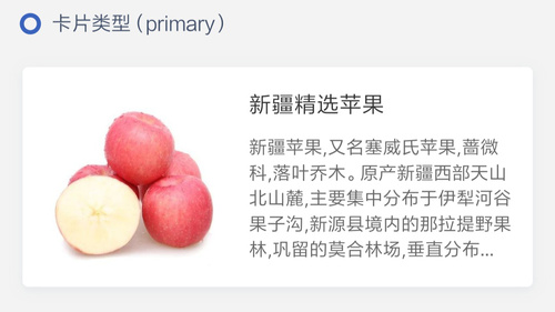
<l-card type="primary"
image="/image/1.png"
title="新疆精选苹果">
<!-- 此处为content -->
<view class="content">
新疆苹果,又名塞威氏苹果,蔷微科,落叶乔木。原产新疆西部天山北山麓,
主要集中分布于伊犁河谷果子沟,新源县境内的那拉提野果林,巩留的莫合
林场,垂直分布区域海拔在1000~1300m的山顶、山坡、河谷区域。
</view>
</l-card>
<!-- cover -->
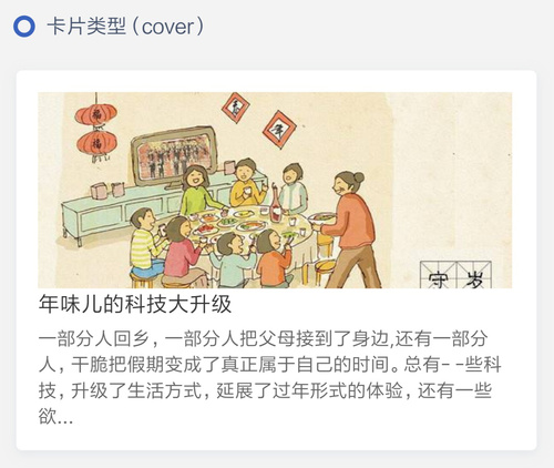
<l-card type="cover"
image="/image/5.png"
title="年味儿的科技大升级">
<view class="content">
一部分人回乡,一部分人把父母接到了身边,还有一部分人,干脆把假期变成了真正属于自己的时间。
总有- -些科技,升级了生活方式,延展了过年形式的体验,还有一些欲...
</view>
</l-card>
<!-- avatar -->
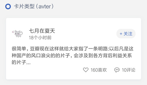
<l-card type="avatar" l-class="card" image="/image/2.png"
title="七月在夏天" describe="18个小时前">
<!-- 此处为content -->
<view class="avter-content">
很简单,豆瓣现在这样就给大家指了一条明路:以后凡是这种国产的风口浪尖的的片子,会涉及到各方背后利益关系的片子...
</view>
<view class="avter-share-container">
<view class="like-container">
<l-icon name="like" color="#666" size="28" />
<view class="number">160喜欢</view>
</view>
<view class="like-container">
<l-icon name="default" color="#666" size="28" />
<view class="number">10评论</view>
</view>
</view>
<l-tag shape="circle"
bg-color="#f3f3f3"
font-color="#3963BC"
slot="more"
size="large">
+ 关注
</l-tag>
</l-card>
# 卡片的图片位置
可通过position属性设置图片的卡片中的位置。默认值为left。
# 示例代码
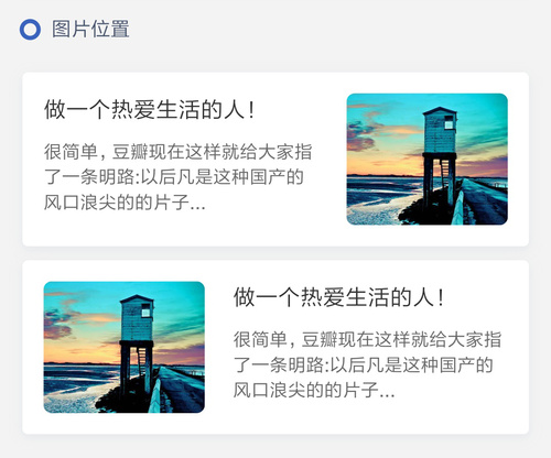
  <l-card  type="primary"
           l-img-class="right-card"
           position="right"
           image="/images/3.png"
    title="做一个热爱生活的人!">
    <view class="content">
      很简单,豆瓣现在这样就给大家指了一条明路:以后凡是这种国产的风口浪尖的的片子...
    </view>
  </l-card>

  <l-card  type="primary"
           l-img-class="right-card"
           position="left"
           image="/images/3.png">
    <view class="content">
      很简单,豆瓣现在这样就给大家指了一条明路:以后凡是这种国产的风口浪尖的的片子...
    </view>
  </l-card>
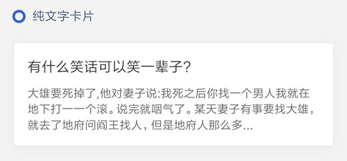
# 纯文字卡片
可通过plaintext属性设置图片的卡片中的位置。默认值为false。
# 示例代码
  <l-card type="primary"
          plaintext="{{true}}"
          title="有什么笑话可以笑一辈子?">
    <view class="content">
      大雄要死掉了,他对妻子说:我死之后你找一个男人我就在地下打一一个滚。
      说完就咽气了。某天妻子有事要找大雄,就去了地府问阎王找人,但是地府人那么多...
    </view>
  </l-card>
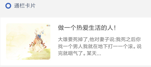
# 通栏卡片
可通过full属性设置卡片为通栏卡片。默认值为false。
# 示例代码
  <l-card type="primary"
          full="{{true}}"
          image="/image/4.png"
          title="做一个热爱生活的人!">
     <view class="content">
      大雄要死掉了,他对妻子说:我死之后你找一个男人我就在地下打一一个滚。
      说完就咽气了。某天...
    </view>
  </l-card>
注意事项
position、plaintext属性仅在type为primary时生效。
# 卡片属性
| 参数 | 说明 | 类型 | 可选值 | 默认值 |
|---|---|---|---|---|
| type | 卡片类型 | String | primary/avatar/cover | primary |
| image | 卡片内图片的路径 | String | --- | --- |
| image-mode | 卡片内图片的显示模式 | 参考微信image组件mode属性 (opens new window) | --- | --- |
| title | 卡片的标题 | String | --- | --- |
| describe | 卡片的描述 | String | --- | --- |
| position | 卡片内图片的位置 | String | left/right | left |
| plaintext | 卡片是否为纯文字卡片 | Boolean | --- | false |
| full | 卡片是否为通栏卡片 | Boolean | --- | false |
# 卡片外部样式类
| 外部样式类名 | 说明 | 备注 |
|---|---|---|
| l-class | 外部样式类,设置整体卡片样式 | --- |
| l-img-class | 外部样式类,覆盖图片(头像)的样式 | --- |
| l-title-class | 外部样式类,覆盖标题(昵称)的样式 | --- |
← 宫格 Grid 瀑布流 WaterFlow →
